The project was very hands-on and experimental. I worked with different contrasts, clean layouts and rough textures, to explore how they interact and influence each other. I was particularly interested in how visual tension can create a stronger reading experience and guide attention across a page.
Rather than following a strict system, I allowed space for testing and iteration throughout the process. This meant trying out different compositions, adjusting typography, and rethinking layouts multiple times. Some decisions were planned from the beginning, while others developed naturally during the design process as new ideas emerged.
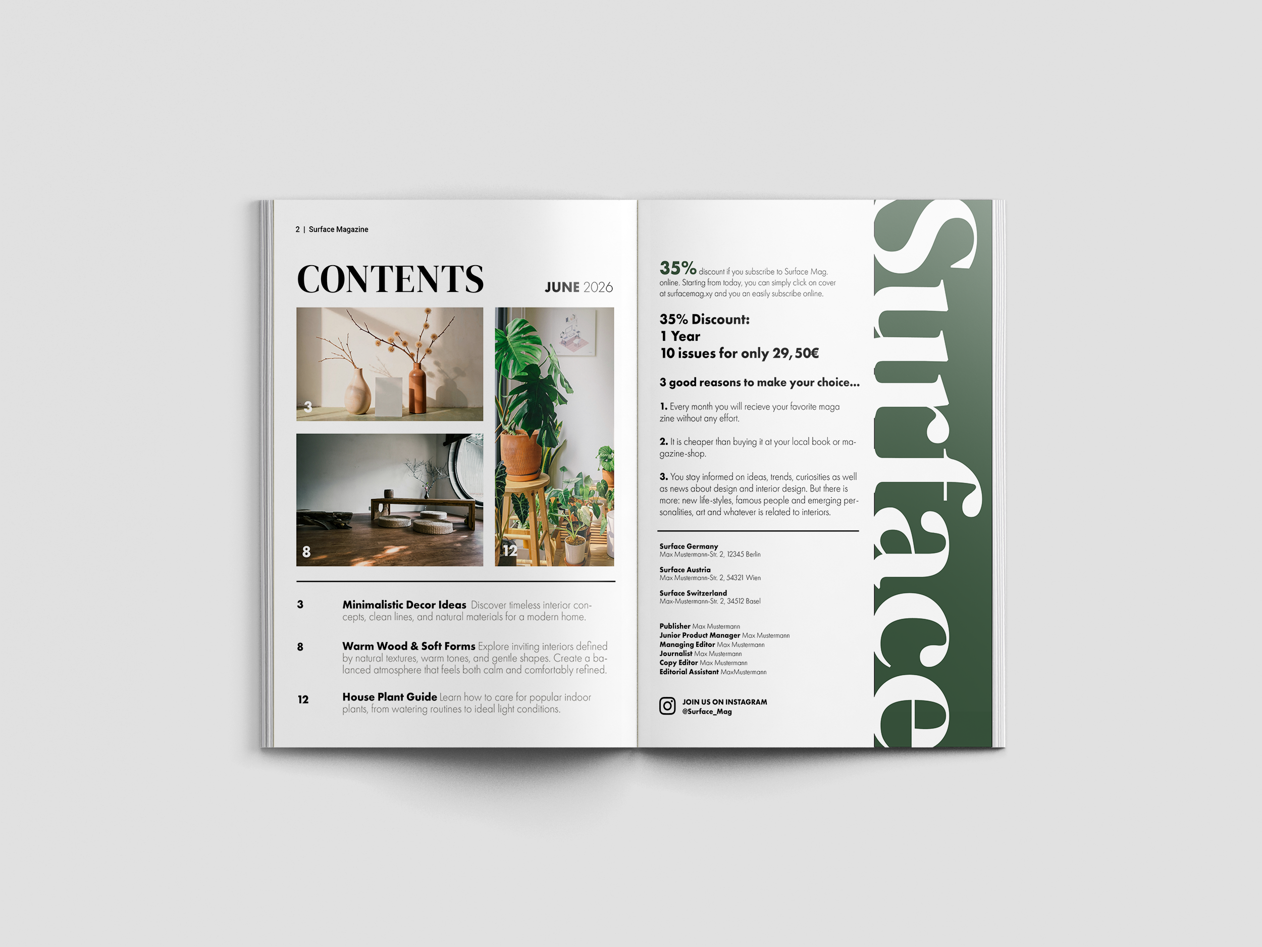
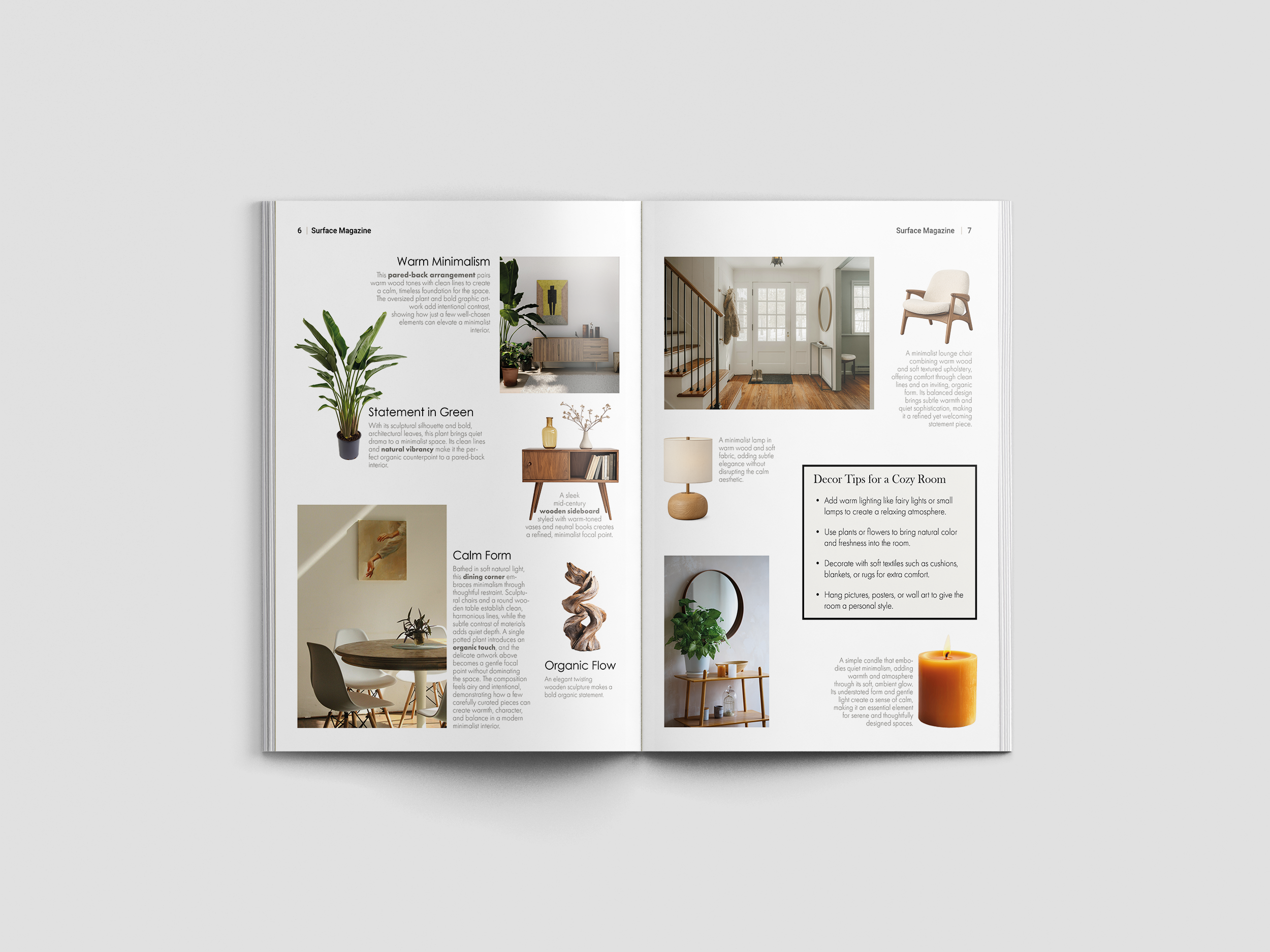
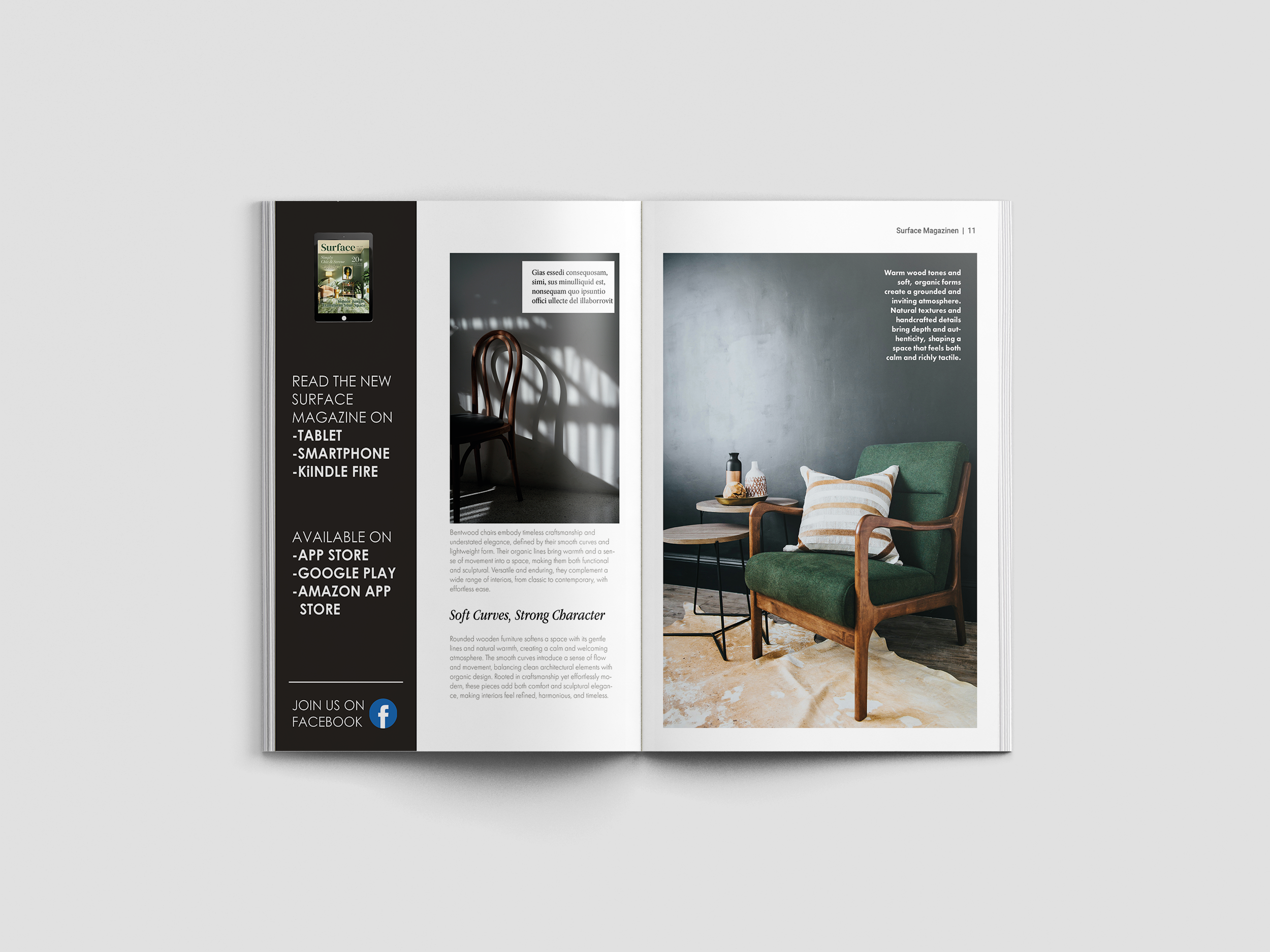
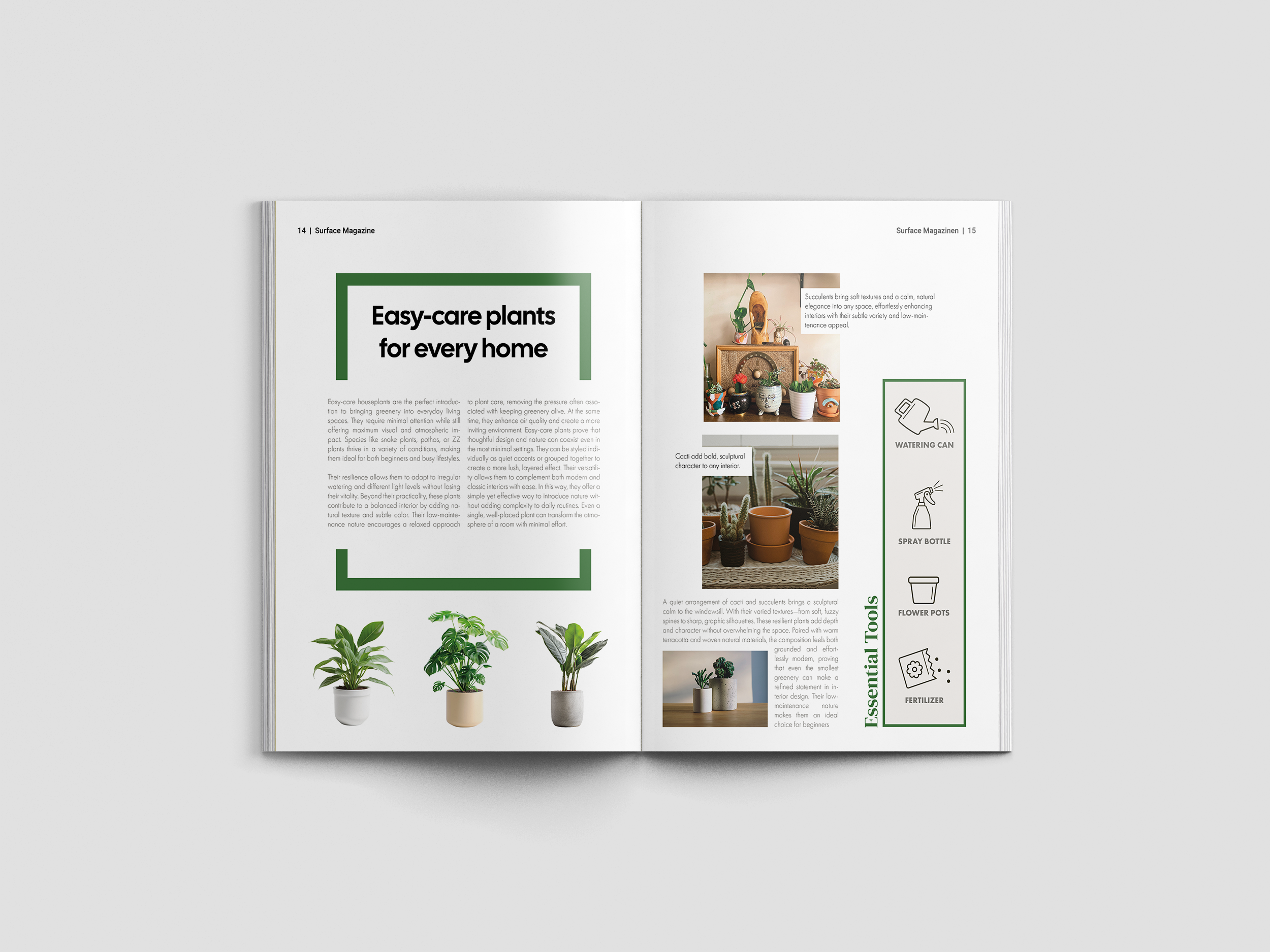
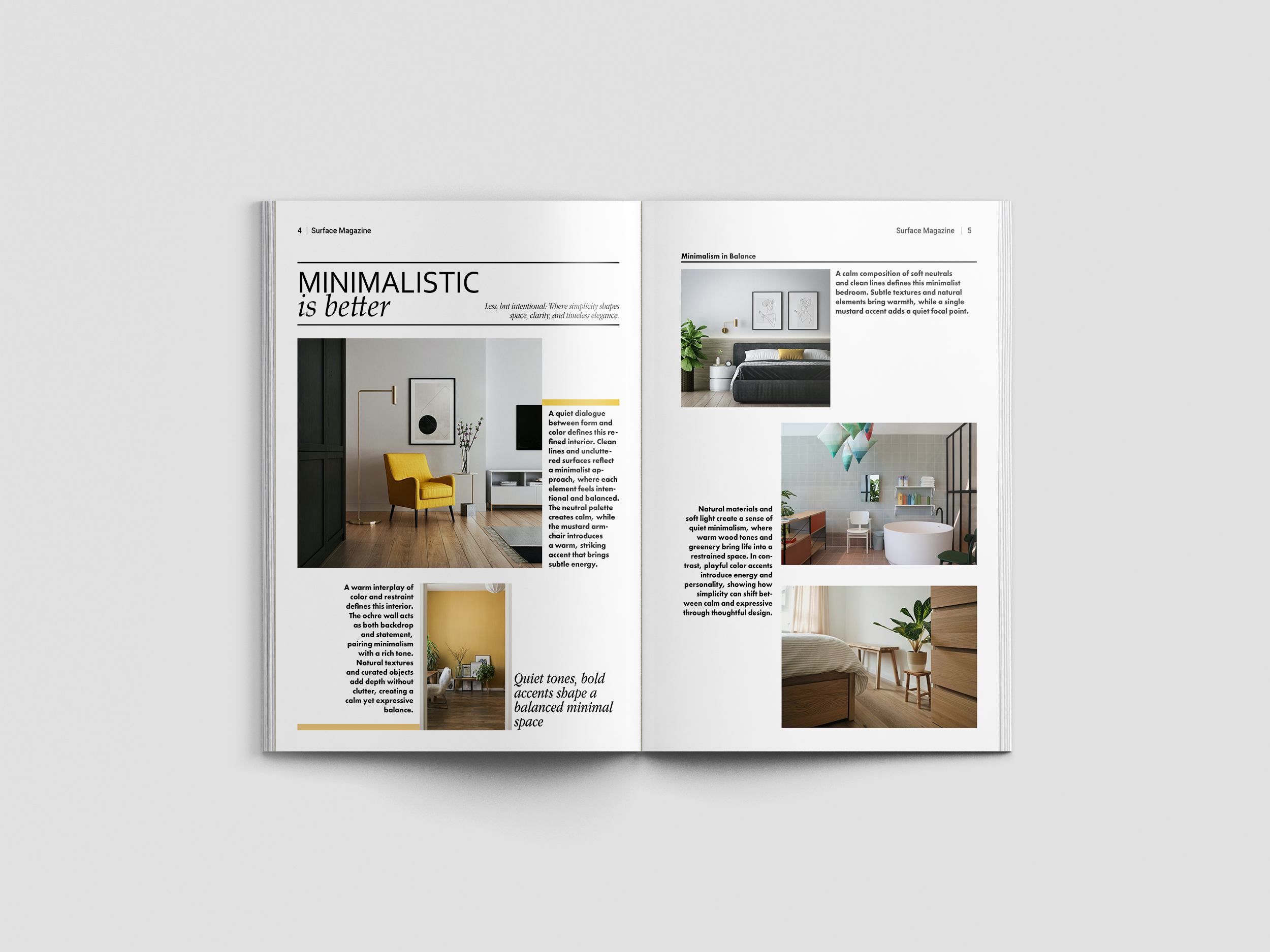
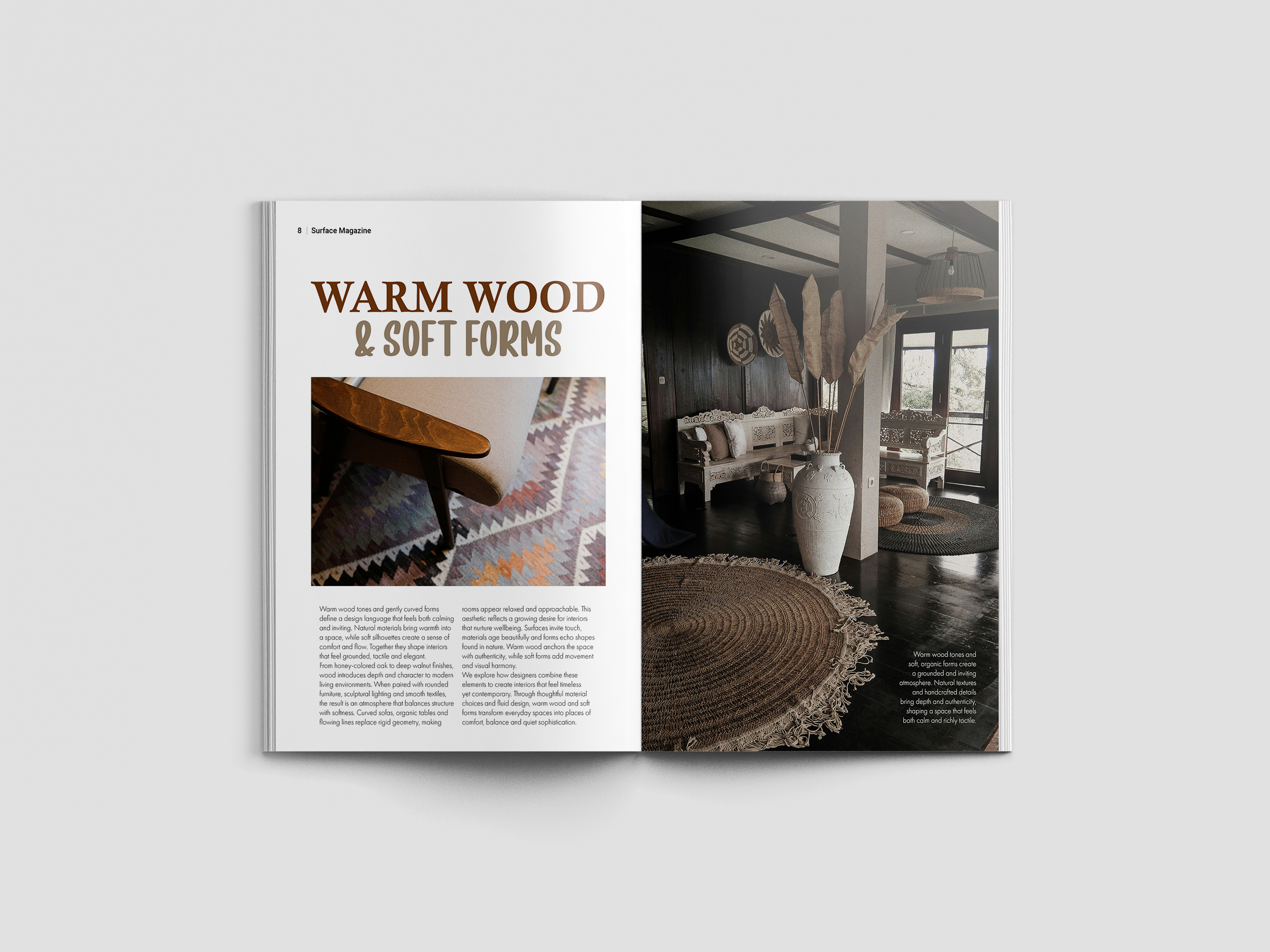
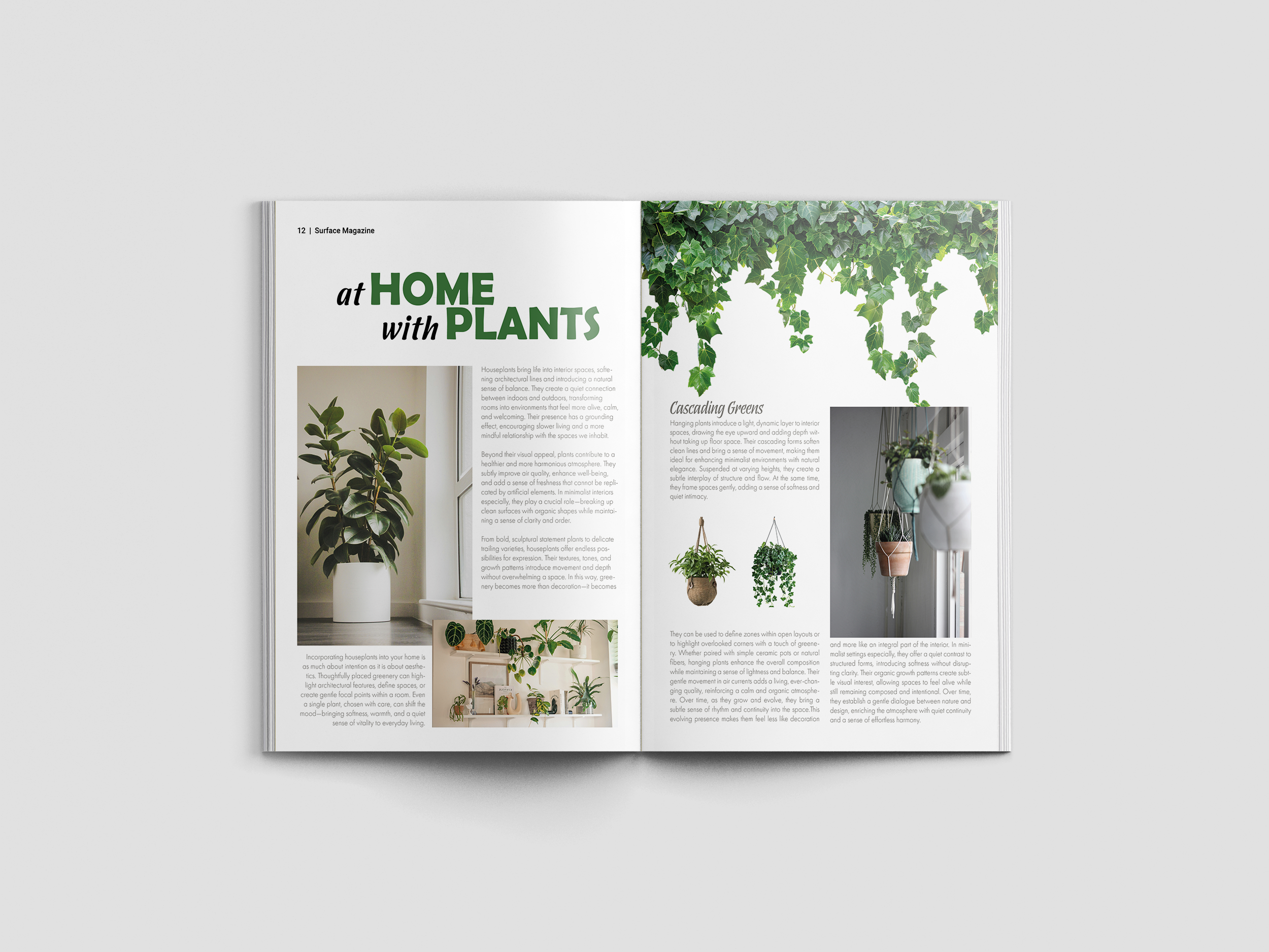
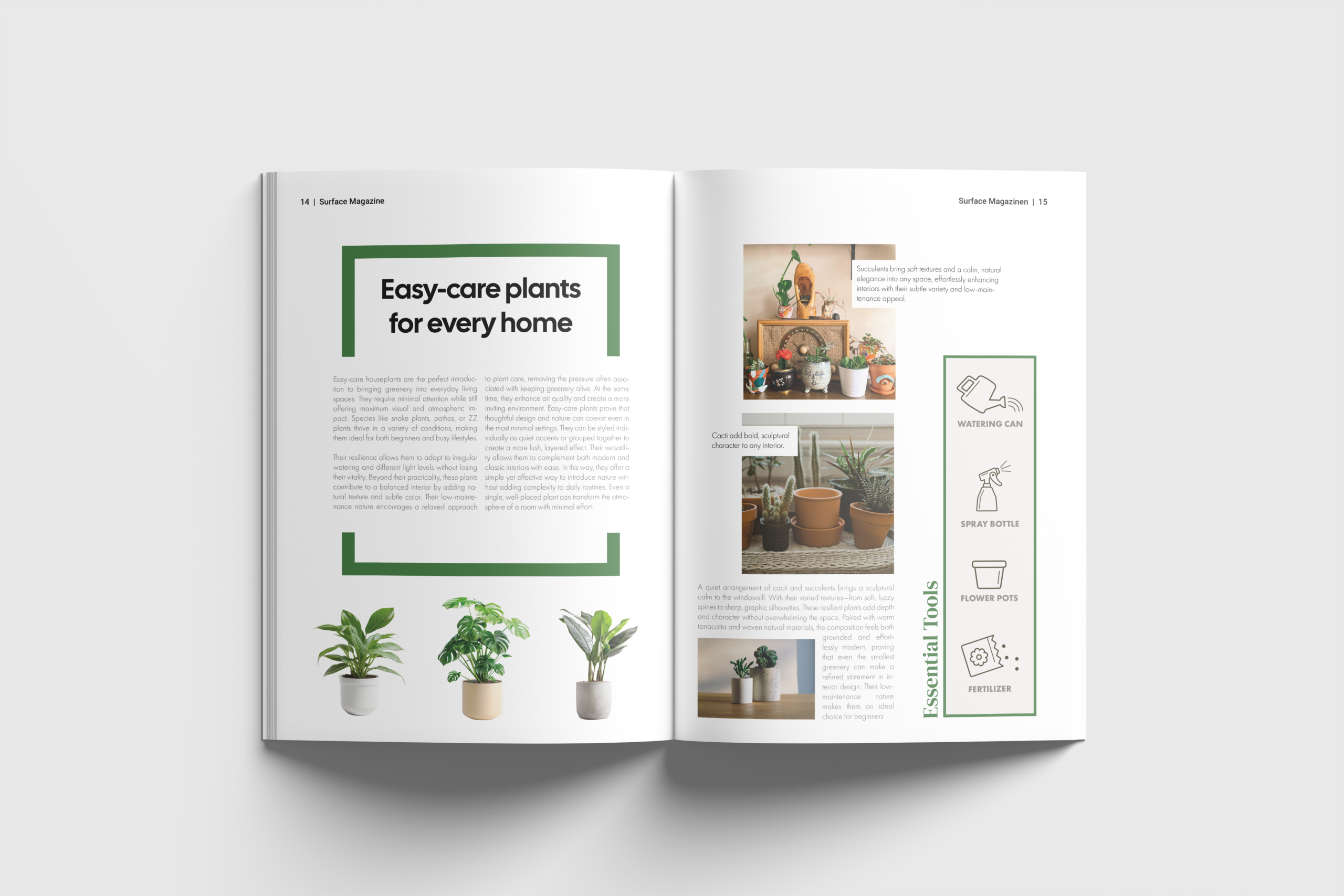
The images used in the magazine are sourced from Unsplash and are free to use. They were selected carefully to support the overall visual direction and to reflect the themes of materiality, space, and atmosphere.
The project itself originated from a personal interest in interior architecture. I wanted to translate aspects of spatial design such as texture, light, and structure into a graphic format and explore how these qualities can be expressed on a flat surface.