Florea – Brand & Visual Design Project

Project Overview
Floréa is a premium skincare brand concept that bridges the gap between modern dermatology and the raw purity of nature. The objective of this project was to develop a packaging design and a visual identity that radiates freshness, purity, and a calming aesthetic.
Visual Communication
The layout was strategically developed to speak directly to the health-conscious consumer:
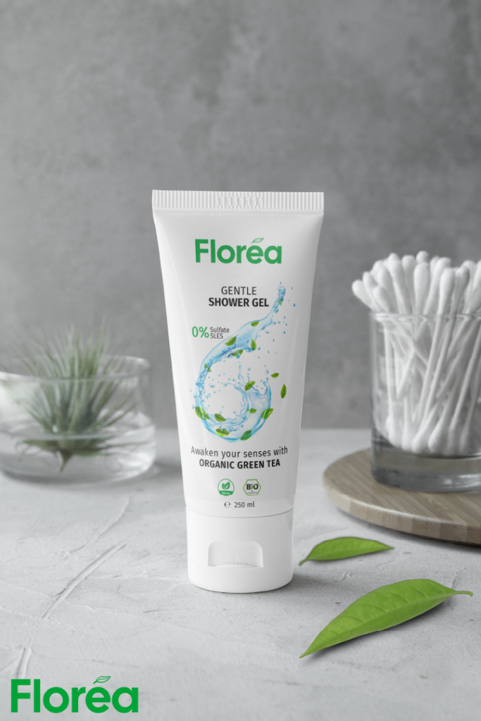
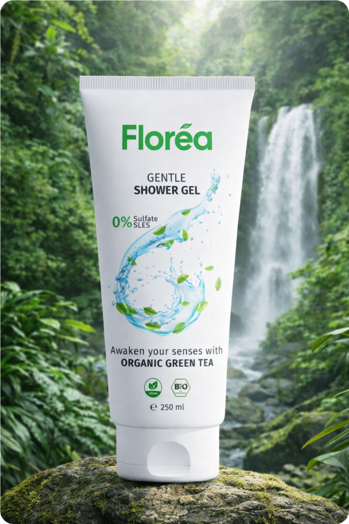
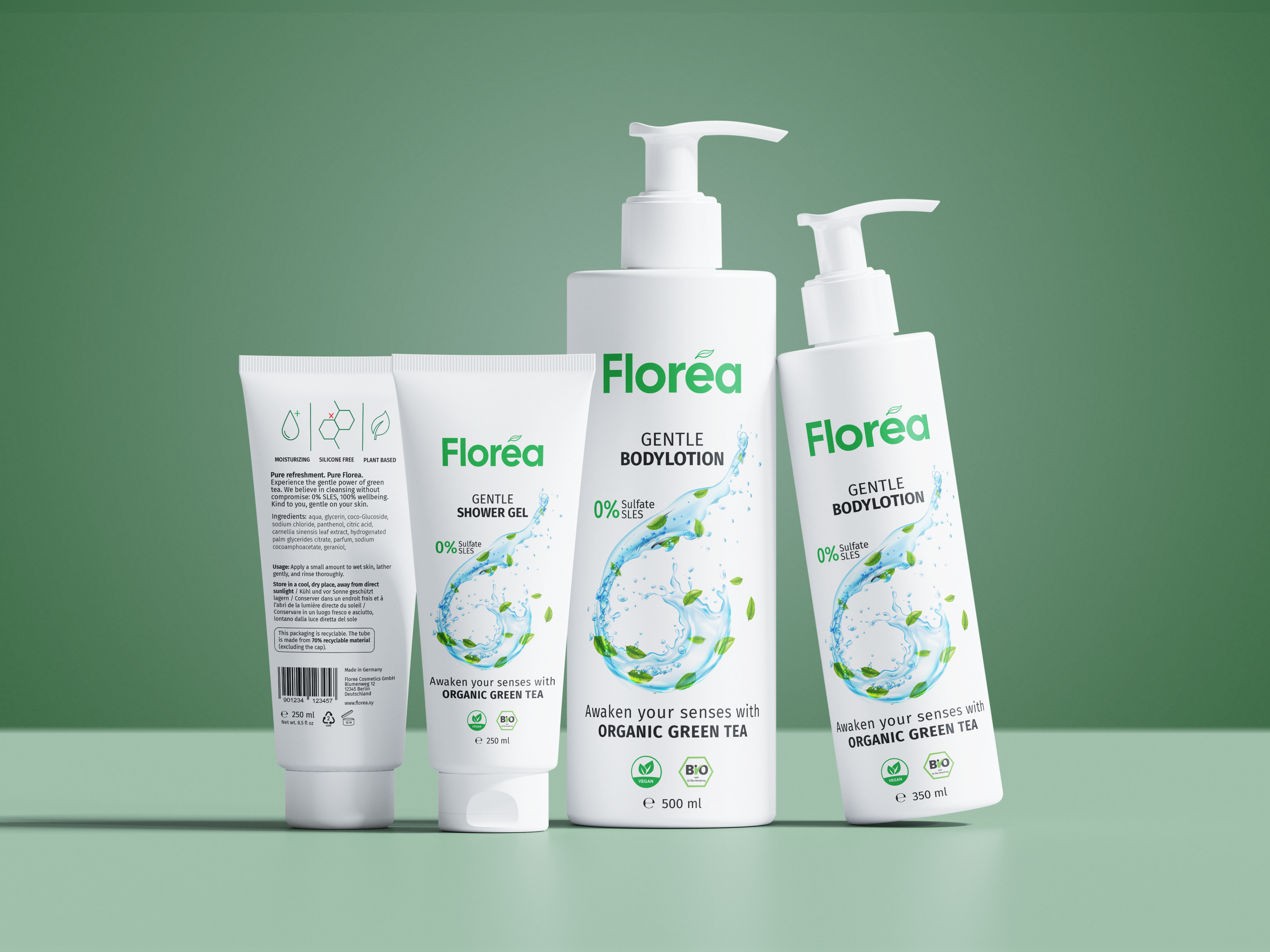
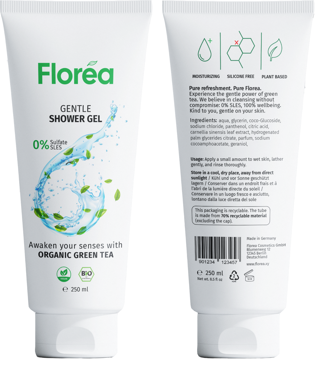
- Hero Ingredient – Green Tea: The central graphic, a dynamic swirl of water and botanical tea leaves, serves as a visual metaphor for the antioxidant power of Green Tea extracts. It visually expresses freshness, purity, and hydration while reinforcing the refreshing sensory experience during application and the plant-based essence of the formulation.
- Clean Beauty Commitment: The „0% Sulfate/SLES“ claim is placed directly alongside the central water swirl, subtly highlighting that the product’s purity is just as essential as its active ingredients. This ensures that the gentle, non-irritating nature of the formula is recognized at first glance.
Logo & Branding
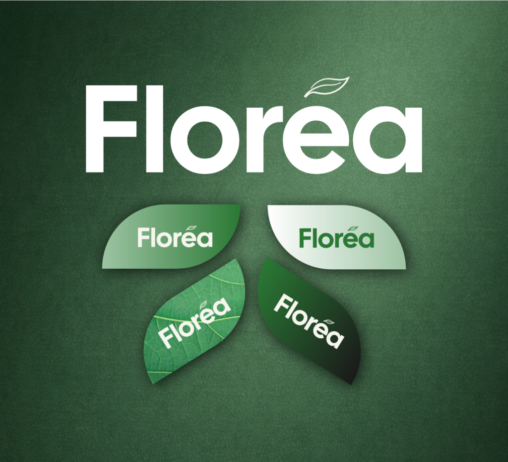
The logo is designed as a calm, confident wordmark that emphasizes clarity and recognizability. It is based on a slightly modified version of Cal Sans Regular, refined to achieve a balanced and contemporary character. The typeface’s rounded proportions create an approachable and natural impression, reflecting the brand’s focus on gentle, plant-based care.
A subtle leaf accent placed above the “e” introduces an organic detail to the otherwise clean wordmark. This graphic element acts as a visual cue for the brand’s botanical origins, adding warmth and character without compromising legibility or simplicity. Together, typography and symbol form a distinctive yet restrained logo that feels modern, natural, and premium.
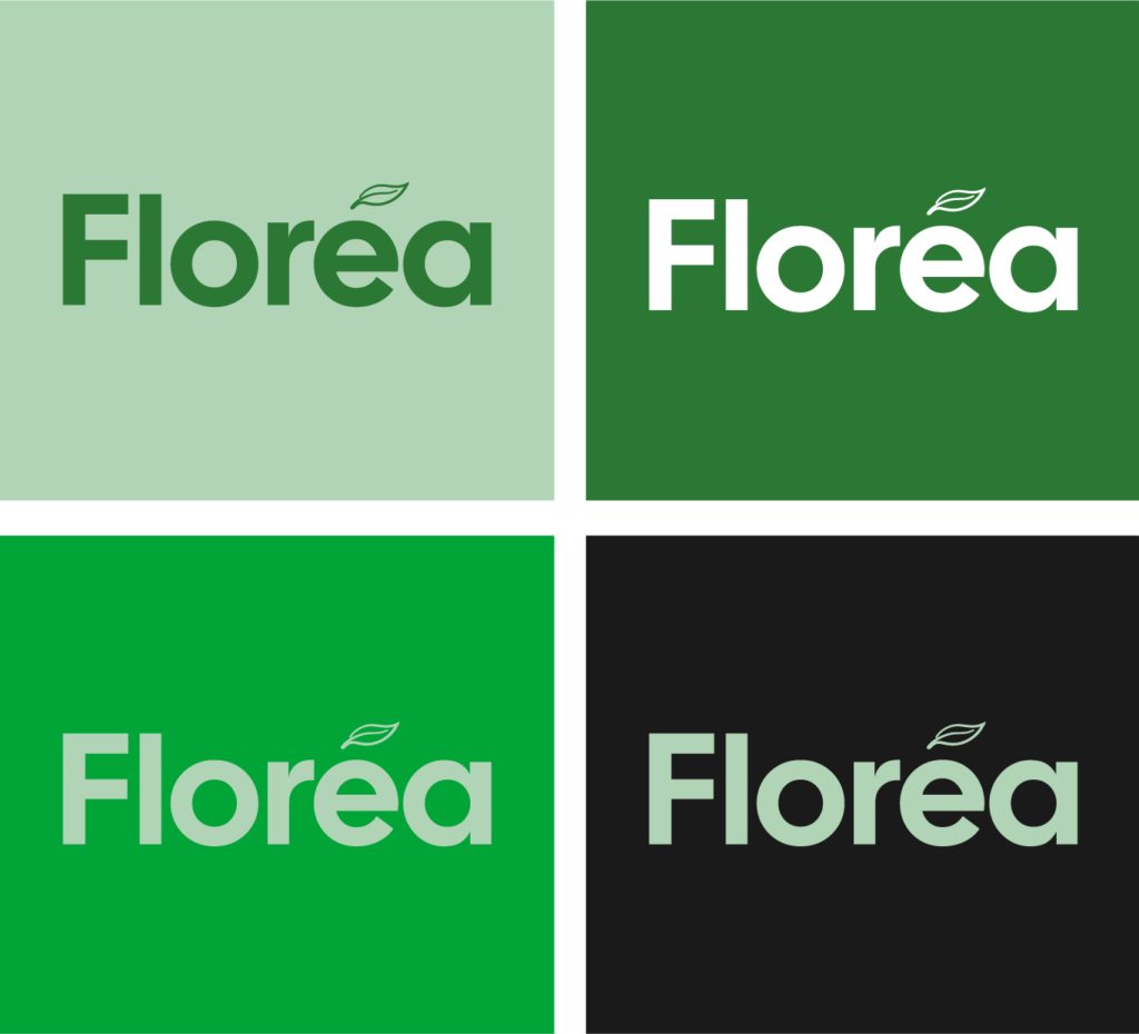
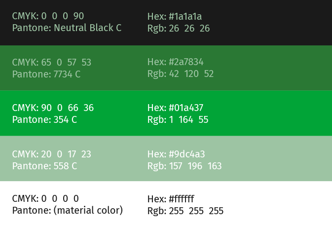
Green is used as the core brand color within the logo, reinforcing associations with nature, freshness, and sustainability. Depending on the background, lighter green tones convey softness and purity, while deeper greens communicate strength, reliability, and premium quality.
In combination with white and black applications, the logo remains flexible and consistent across different contexts. This restrained use of color ensures strong contrast, high legibility, and a timeless appearance, while allowing the brand to shift between emotional warmth and professional clarity.
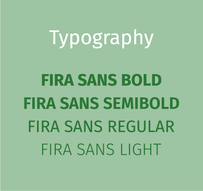
The design follows a clean, modern typographic approach that communicates clarity, quality, and trust. The typeface Fira Sans is used in Bold, Regular, and Light, creating a clear visual hierarchy and a balanced reading flow.
- Bold is applied to key statements, giving them strong presence and high visibility.
- Regular is used for product names and essential information, ensuring clarity and readability.
- Light supports longer and secondary text (back side) while also adding lightness and refinement
This typographic system appears contemporary and restrained, reinforcing the product’s premium and natural positioning.
The color concept is deliberately minimal. Green acts as the primary accent color, symbolizing nature, freshness, and plant-based ingredients, while black typography provides strong contrast, stability, and legibility against the white background.Together with white, this palette creates a clean, modern, and timeless aesthetic that keeps the focus on the brand and its values.
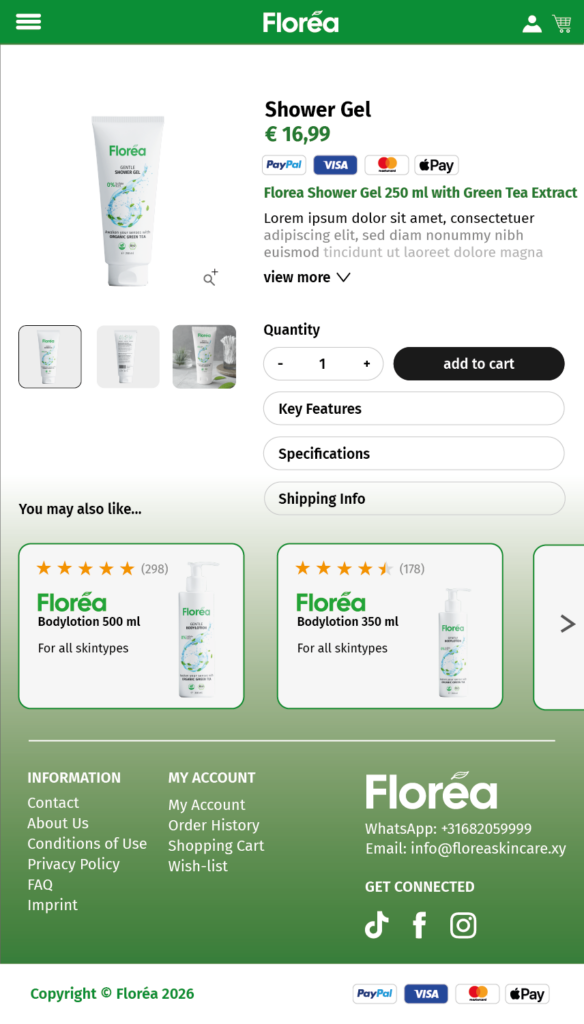
Web Design